A bigly presidential Twitter timeline

Take the well-known twitter account, all1 of its tweets, and a diagram in which we carefully place the tweets on the two axes according to day and time of publication. The result:

A bigly presidential Twitter timeline

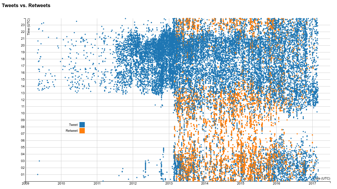
Pretty! Also, tweets and retweets are distinguished as well!

One might assume that Twitter did not introduce native retweets before 2013. Wrong! The have been available since 2009. Also, the data mainly contain “retweets” of this style:

Obviously, something changed according to the twitter usage in 2013. From then on, he’s an avid retweeter, mainly at night time2. The businessman’s regular tweets are still mainly published during business hours. What is also remarkable: The candidacy was announced in Juni 2015. Starting in the middle of 2015 the nightly retweet-orgies seem to thin out as well.

A bigly presidential Twitter timeline

Just watching “The Celebrity Apprentice 5” and live-tweeting. Lol!

But behold! Our data offers so much more. We can also color the dots according to the client that has been used.

A bigly presidential Twitter timeline

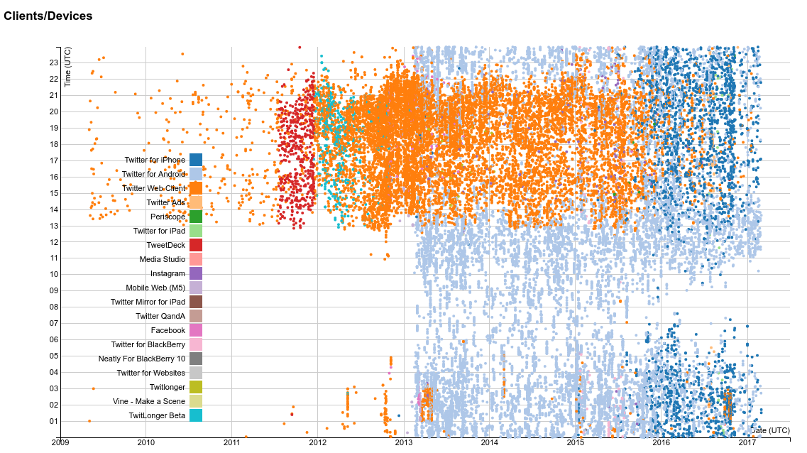
Oh boy, so many colors!

Let us have a look, shall we. In the beginning, only the web client / website is being used. He discovers TweetDeck in the middle of 2011, but replaces it with TwitLonger (Slogan: When you talk too much for Twitter) around christmas.

In 2013 he gets a new toy – an Android smartphone – which he uses to tweet and, as we learned before, retweet, at night. During business hours, the web client remains the client of choice, until it is replaced by an iPhone at the end of 2016. Or is that the apprentice who is tweeting? Some might think so.

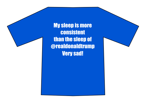
There is one last pressing question: Does he sleep? Let’s compare that with an average person… well, I just have my own data:

A bigly presidential Twitter timeline

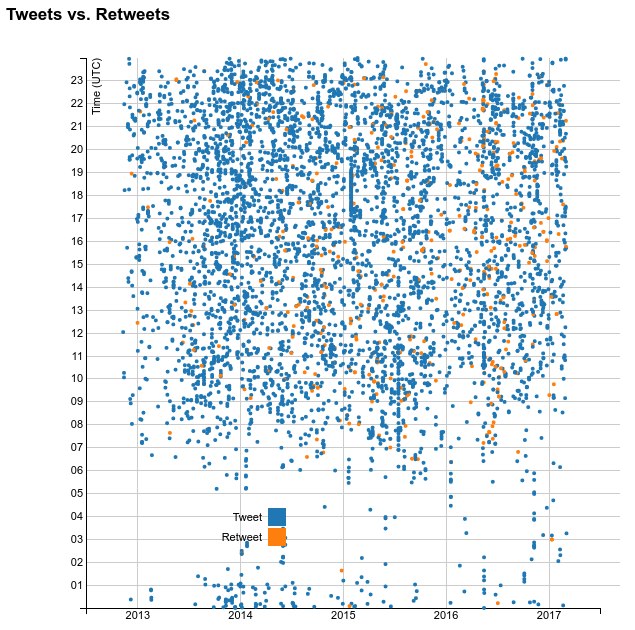
I have just been tweeting since 2013, sorry! ❤

So if he sleeps, his sleep is less consistent than mine. I should probably have that printed on a T-shirt.

A bigly presidential Twitter timeline

Of course the diagrams are not only raster images, but also available as a dynamic visualization so you can play with them yourselves.

Follow me, please.

The dataset has been taken from the truly great Trump Twitter Archive. They also archive other politicians’ tweets.

  1. That is, all tweets that our dump contains.
  2. Note that the timestamps are in UTC 😉

Ein Twitter-Gesamtbild

Man nehme: Den bekannten Twitter-Account, alle1 Tweets davon, und ein Diagramm, das die Tweets nach Tag auf der einen und Uhrzeit auf der zweiten Achse aufträgt. Heraus kommt in etwa folgendes:

Ein Twitter-Gesamtbild

Hübsch! Und netterweise noch nach Tweets und Retweets sortiert.

Nun könnte man annehmen, dass Twitter die native Retweet-Funktion erst 2013 eingeführt hat. Allerdings gibt es die bereits seit 2009, und der Datensatz enthält vor allem solche “Retweets”:

2013 hat sich also offenbar etwas in der Twitter-Nutzung geändert. Es wird jetzt fleißig retweetet, und zwar vor allem Nachts2 Die regulären Tweets des Businessman konzentrieren sich weiterhin auf die Business Hours. Auch interessant: Im Juni 2015 wurde die Präsidentschaftskandidatur verkündet. Ab Mitte 2015 dünnen sich die nächtlichen Retweet-Orgien offenbar wieder aus.

Ein Twitter-Gesamtbild

Hier lief wohl gerade “The Celebrity Apprentice 5”

Doch der Datensatz bietet noch mehr: Wir können die Punkte auch nach verwendetem Client einfärben.

Ein Twitter-Gesamtbild

Hui, das ist ja ganz schön bunt.

Na, dann schauen wir mal: Zunächst wird nur sporadisch der Web Client, also die Webseite, benutzt. Mitte 2011 entdeckt er TweetDeck, was aber um den Jahreswechsel durch TwitLonger (Slogan: When you talk too much for Twitter) ersetzt wird.

2013 bekommt er offenbar ein neues Android-Smartphone, mit dem dann nachts fleißig getwittert, und – wie wir von oben wissen – retweetet wird. Während der Business Hours ist weiterhin der Web Client Mittel der Wahl – er wird erst zum Jahreswechsel 2016 durch ein iPhone ersetzt. Oder twittert da der Praktikant? Viele vermuten das.

Eine letzte Frage drängt sich allerdings noch auf: Schläft der auch mal? Zum Vergleich das gleiche für einen normalen Menschen… na gut, für mich:

Ein Twitter-Gesamtbild

Twitter erst seit 2013, sorry!

Also wenn er schläft, dann unregelmäßiger als ich. Direkt ein Shirt drucken lassen.

Ein Twitter-Gesamtbild

Natürlich gibt es die Diagramme nicht nur als Pixelgrafik, sondern direkt als Visualisierung zum selbst-damit-spielen.

Hier entlang, bitte.

Die Daten stammen vom großartigen Trump Twitter Archive, das außerdem noch weitere Politik-Twitternasen archiviert.

  1. Das heißt, alle, die der Dump hergibt.
  2. Zeitverschiebung zur UTC beachten 😉